Page 2 of 6
Re: Chaos Web Design
Posted: Fri Nov 21, 2014 11:40 pm
by thatscrawnykid
That one with the proxies is pretty much perfect. I feel like the text should be the top layer though. Other than that its perfection IMO.
Re: Chaos Web Design
Posted: Fri Nov 21, 2014 11:51 pm
by cyberhawk
I think you're right about the text overlap....thanks.

I'm finally digging it.
Re: Chaos Web Design
Posted: Fri Nov 21, 2014 11:57 pm
by thatscrawnykid
That is beast man, seriously good job. The swords could use a bit of reflective color from the other elements and a bit of orangeyness to tie them in with the rest.
Re: Chaos Web Design
Posted: Sat Nov 22, 2014 12:58 am
by cyberhawk
Re: Chaos Web Design
Posted: Sat Nov 22, 2014 1:43 am
by thatscrawnykid
Nice, very subtle but I think it makes all the difference. I'm working on improving the proxy mines I will get you some HD renders of those little buggers soon. I for one am very happy with this design great job man.
Re: Chaos Web Design
Posted: Sat Nov 22, 2014 3:15 am
by cyberhawk
Thanks man...I darkened the swords a bit too.
Re: Chaos Web Design
Posted: Sun Nov 23, 2014 3:25 am
by cyberhawk
For the Holidays:

Re: Chaos Web Design
Posted: Sun Nov 23, 2014 5:24 am
by Dr.Flay
The skeletal arms are a little too Halloween (which will be useful for then).
The skull and crossed swords lends itself to a very distinctive "Jolly Roger" style emblem. Handy for flags etc.
This can also easily fit the back of a Chaos skin, should anyone want to.
A nice olde world feeling with a hint of technology. Nice. It stays well away from Cyber-punk.

Nice Gothic horror vibe.
Hehe, the comparison to the elven helpers is very suitable.
Re: Chaos Web Design
Posted: Sun Nov 23, 2014 1:59 pm
by R.Flagg
Well done Mr. Hawk, well done.

It's beautiful.
Re: Chaos Web Design
Posted: Sun Nov 23, 2014 3:01 pm
by cyberhawk
Thanks everyone for the push in the right directions.
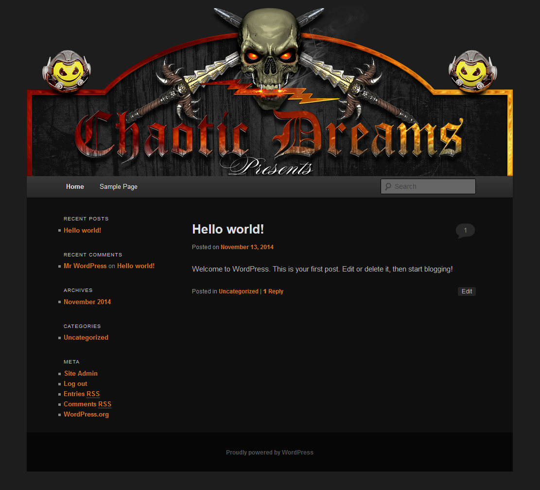
Here are both headers in .jpg for the site:


You'll have to add the following code to your style.css to make it fit properly:
#branding img {
margin-top: -32px;
}
Re: Chaos Web Design
Posted: Mon Nov 24, 2014 9:52 pm
by Dr.Flay
I meant to say, I love the grain in the background.
It brings to mind, condensation running down a grimy window, and also looks rather like a back-lit foggy tree-line (squint your eyes).
Clammy and claustrophobic.
The header as-is, does not quite fit FB (Damn them for not supporting transparency in the avatar)
If I shrink it a bit, I can get the full "Chaotic" visible, but it may look a little cropped underneath.
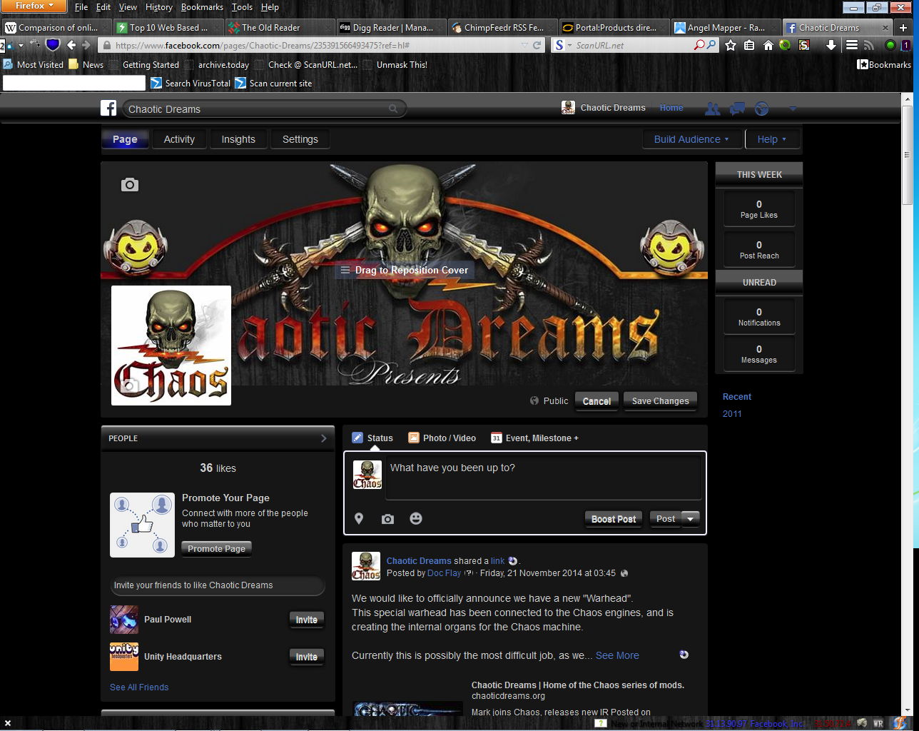
- FBheader.jpg (195.01 KiB) Viewed 23262 times
*ahem*
You may well now see why I approve so heartily on the current design

I always find black wood skins for all my software if possible, and use "Stylish" to make sites look much nicer (and darker).
Shame we can't set the FB page to actually look more like that ^
Re: Chaos Web Design
Posted: Tue Nov 25, 2014 12:54 am
by R.Flagg
Just to offer an opinion, I don't think all the various sites need to look the same. So long as they all sport the same logo somewhere.
But that's just an opinion. Those sites are your domain, so proceed as you see fit.

And thank you!
Re: Chaos Web Design
Posted: Tue Nov 25, 2014 3:22 am
by Dr.Flay
Yeah, I agree. Hence I only mocked it up so we have a better idea of what is needed in FB.
I was actually thinking of the spirit and trail, heading from left to right, and the logo on that.
Re: Chaos Web Design
Posted: Thu Nov 27, 2014 6:43 am
by cyberhawk
Almost finished with the new website design. Once I get it all tweaked out, I'll put it up and make it live. From there, we can add, change or take away. Have a Happy Thanksgiving everyone!!!!
Re: Chaos Web Design
Posted: Thu Nov 27, 2014 12:45 pm
by R.Flagg
Awesome news Greg!
Very excited, and very thankful.
Happy Thanksgiving!
